
It’s easy to tell which companies truly believe in their products. They offer free trials without requiring users to enter their credit card details. YNAB is a good example. If you know your product is amazing, why put roadblocks that prevent users from trying it out?
Other companies will push free trials and require payment information, hoping for one of the following outcomes:
- Primary goal: Users get hooked on the product and become paid (and engaged) users and evangelists.
- Consolation prize: Users forget about the free trial and get billed once the trial period expires. A segment of these users won’t see the charge on their credit card statements.
I always laugh at supposed “product-led companies” who create a matrix-style Easter egg hunt for users to find where to cancel their free trial subscriptions. These companies may look at retention data that proves they’re reducing free-trial churn, but they have no idea the damage that they’re doing to their brand. It’s short-term thinking.
Recently, I signed up for a 7-day free trial on Trint, which provides automated audio transcription services. The trial requires credit card details, so I set a reminder to cancel my subscription before being billed. For background, there are several audio transcription products – Descript, Rev, Temi, etc. – and I’m testing them out to see which one is most accurate.
In the process of canceling my Trint subscription, I took screenshots of their attempts to keep me as a customer. See below for examples and analysis.

Step 1: Trint makes it fairly easy to find where to cancel your free trial. Once you click on your profile icon, you click on “Plan.” I hesitated slightly because I wasn’t sure if I should click on “Billing” or “Settings” instead. The green “Upgrade” button made it more clear.
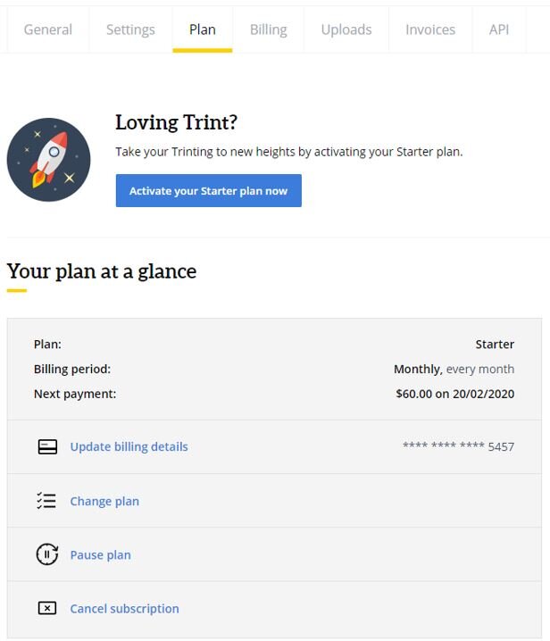
Step 2: Once users land on Trint’s “Plan” section, they must scroll to the bottom of the page to cancel their free-trial subscription. Notice that “Pause plan” is directly above “Cancel subscription.” This is smart placement to highlight an alternative to canceling.

Step 3: Now we’ve officially entered the cancel flow. Trint plays into psychology by highlighting a price comparison with coffee. Also, they mention the “Pause plan” option again, and notice that the “Pause plan” button is blue, which is more attention-grabbing than the white font used in the “Continue to close account” button. They also add a pause icon to their logo next to “We hate goodbyes” as a subtle reinforcement.
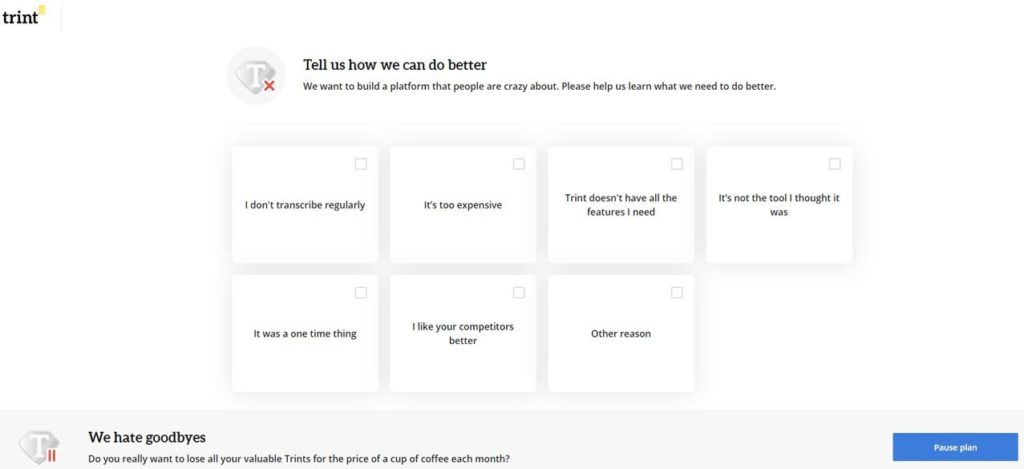
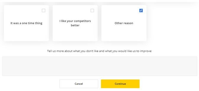
Step 4: At this point, you could argue that Trint is creating unnecessary steps to prevent users from canceling. In this instance, though, I think posing these questions demonstrates that Trint cares about users’ opinions and genuinely wants to improve their product. A lot of companies wouldn’t bother. So this actually doesn’t bother me.
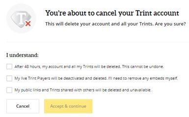
Step 5: Trint is now playing into FOMO to retain users. By forcing users to acknowledge all of the items they will lose out on by canceling, they’re making users recognize all of Trint’s unique value props and they’re creating uncertainty and doubt in the minds of users. Whereas before, I was impulsively moving through the steps. This made me pause to consider my decision carefully.
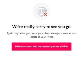
Step 6: This page hit home as the point of no return. A few things stand out to me. The use of red font on the button is meant to cause alarm. The words on the button (i.e. delete, permanently, and erase) are heavy. The red X on the logo creates an immediate negative visceral reaction. The design and copy on this page remind me of the road signs you see if you were to drive the wrong way down a highway on-ramp.
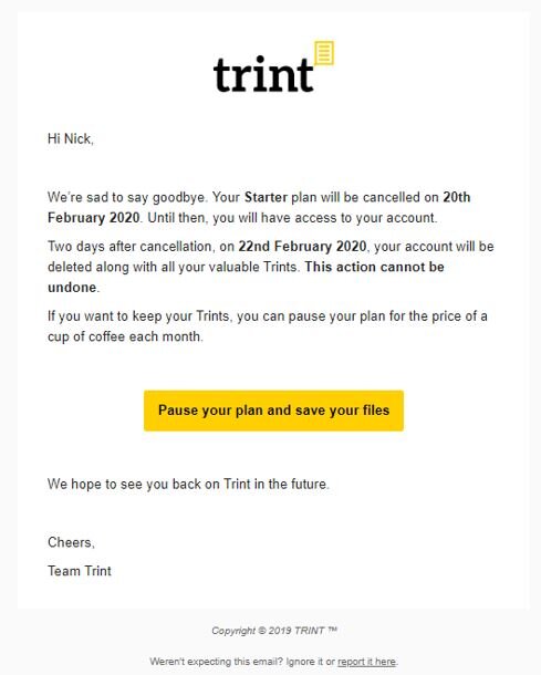
Step 7: After finishing the cancellation process, this email from Trint arrived in my inbox. Despite my fears on the previous step, Trint offered me a lifeline to retain my files. This is a smart move to capitalize on users who may feel remorse from canceling their accounts. One move that Trint doesn’t offer in this email is a discount code to incentivize users to pause their plan or sign up for a paid plan. That could be effective.
Overall, Trint has a good product and their approach to retaining free-trial users is thoughtful without seeming too burdensome. Every company should aspire to educate users on their product(s) before users decide to cancel their service. The trick is to do so in a respectful manner. In my opinion, Trint achieves this.


