This May, we announced our rebrand, relaunch, and merge from 3rd & Lamar and 3rd & Lamar Media to the unified 3rd + Lamar.
This is the story of the months of strategy meetings, typography debates, WordPress theme experimentation, and thoughtful conversations about our new direction that culminated in the rebrand.
In the process, we learned a lot about brand identity, marketing, and our vision for the company.
To merge or not to merge
The rebranding process began with a thorough analysis of our previous branding and a clear understanding of our target audience and goals.
When we began this project, we weren’t sure whether we wanted to merge the two wings of our business: We just knew that our brand was confusing, and we needed to make it clear.
When launching 3rd & Lamar and 3rd & Lamar Media, our founders took inspiration from VICE and VIRTUE, VICE’s ad wing. 3rd & Lamar was meant to be the home of our Austin business news coverage, while 3rd & Lamar Media was designed to be our ad agency and production house site.

But that distinction never fully crystallized as the segments of our business began to overlap in ways that we didn’t anticipate, particularly as live music production grew during the pandemic. For instance, clients like Austin Monthly hired us to produce their live concert series, and we also produced live music streams for our owned and operated events.
After much consideration, we decided to merge. We wrote more about that decision here.
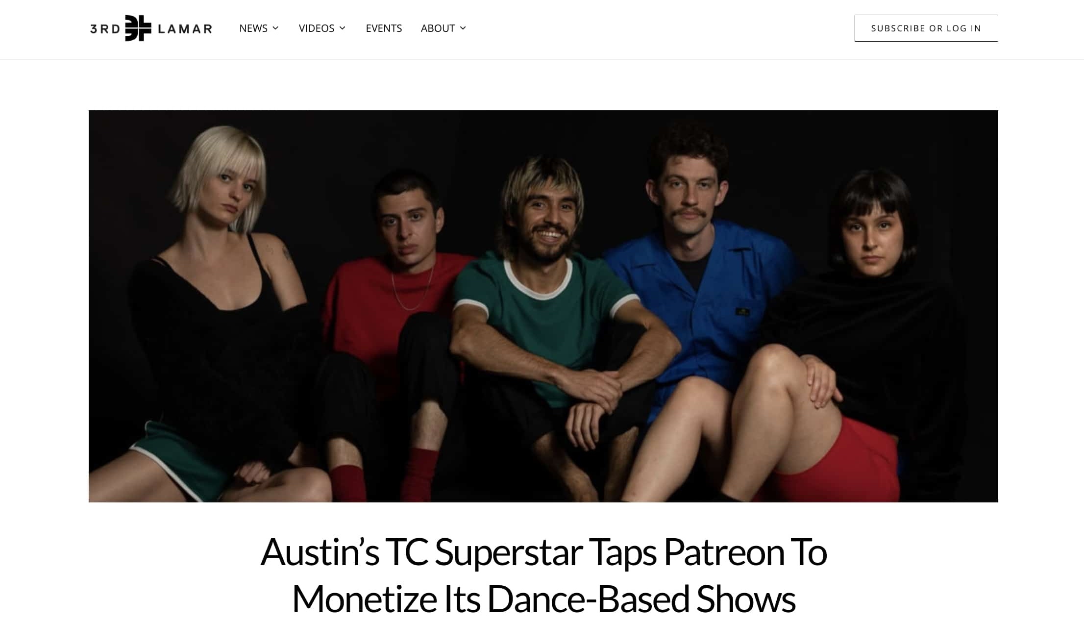
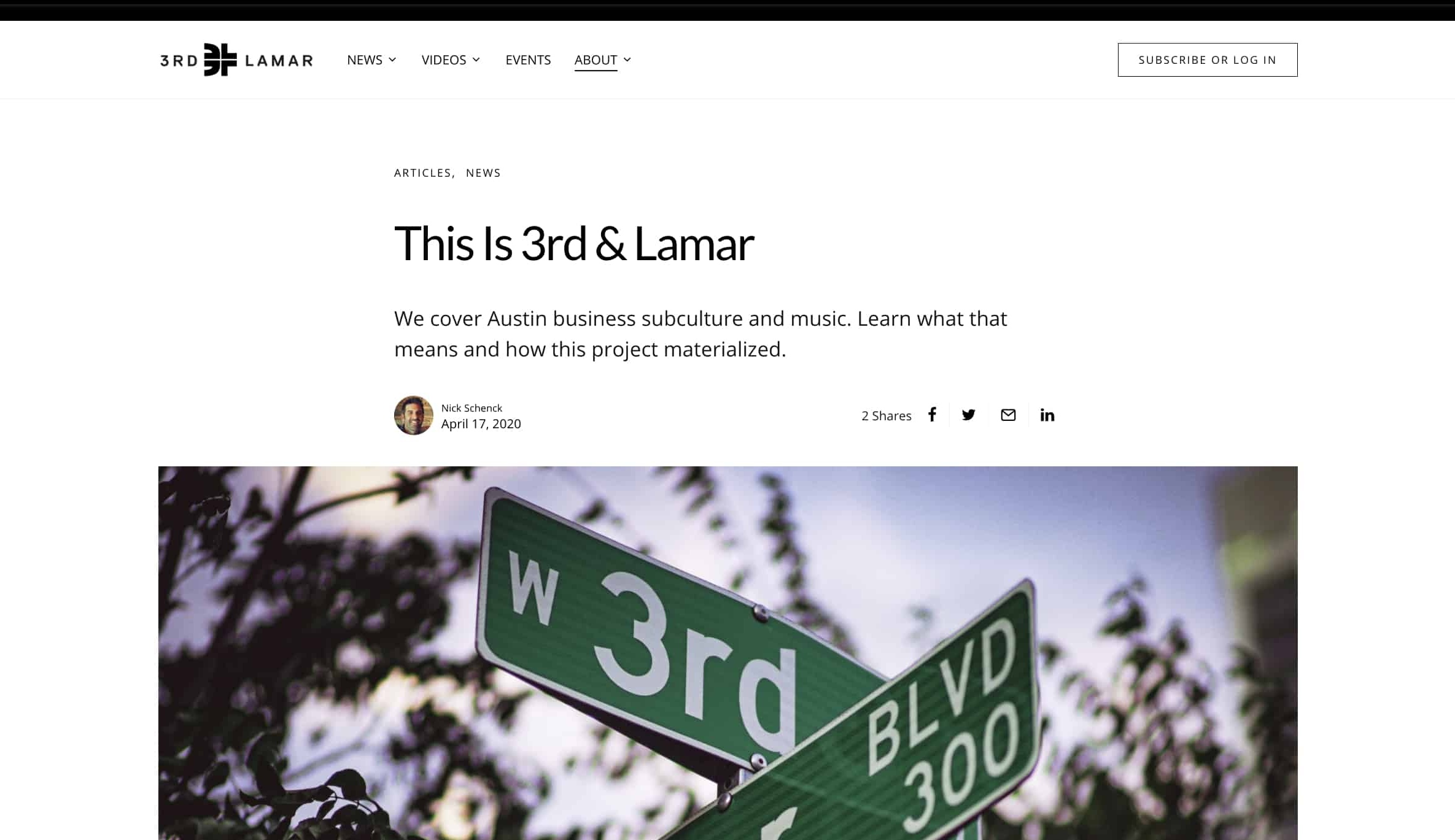
Our new branding needed to serve dual purposes: Put our work front and center, but also leave room for our original coverage of Austin’s creator, production, and marketing community.
Our new design needed to clearly communicate our unique value proposition and differentiate 3rd + Lamar from other media agencies.
Cross-Streets, Texas Sun, + Breaking News
We hired our late friend Matt Schoen, VICE Media’s former executive design director, to develop updated brand guidelines for us.
He took our many, many visual references, hopes, concerns, and favorite albums into consideration and presented us with three top-line visual directions to choose from: Cross-Streets, Texas Sun, and Breaking News.
Cross-Streets referenced our name—an intersection—and Austin’s status as a hybrid city where technology, live music, mid-century design, and stoner culture coexist. Visually, this direction incorporated intersecting type, sideways images, and Austin’s skyline.

Texas Sun encapsulated the aesthetics of travel and cosmic music culture with a dash of the 70s. Schoen proposed using a round, friendly typeface, geometric lines, and a warm color palette.

Breaking News was inspired by a conversation we had about capital “J” journalism and how we aspire to cover Austin in a way that feels like it’s from a trustworthy magazine rather than a blog. This direction referenced tabloids with a bold font, wide images, and brief copy.

We gravitated toward the intersectional design and meaning behind the Cross Streets theme and the brevity and boldness of the headlines in Breaking News. So we asked Schoen to combine the two. Our new ethos was, “work first.”
We also loved the energy of the “Aires Libres Toilet Paper” magazine and how it reminded us of red neon lights seen throughout Austin, so we adopted a similar orangey red as our accent color and named it “Red River.” And to reference our logo icon’s negative space, we replaced the ampersand in our name (and throughout our posts) with a plus sign.
After much deliberation, we chose our new fonts, Inter and Lora.
Inter is our heading and sub-heading font.
Lora is our body font.
Schoen cleaned up our logos and created our brand book. The refreshed visual identity includes a new color palette and font choices.
And voila! We had a refreshed brand. Well… almost.
Demo-ing our dot com
The next step was merging our sites. We had been running two separate websites (3rdandLamar.com and 3rdandLamarMedia.com) using two different content management systems and independent website taxonomies.
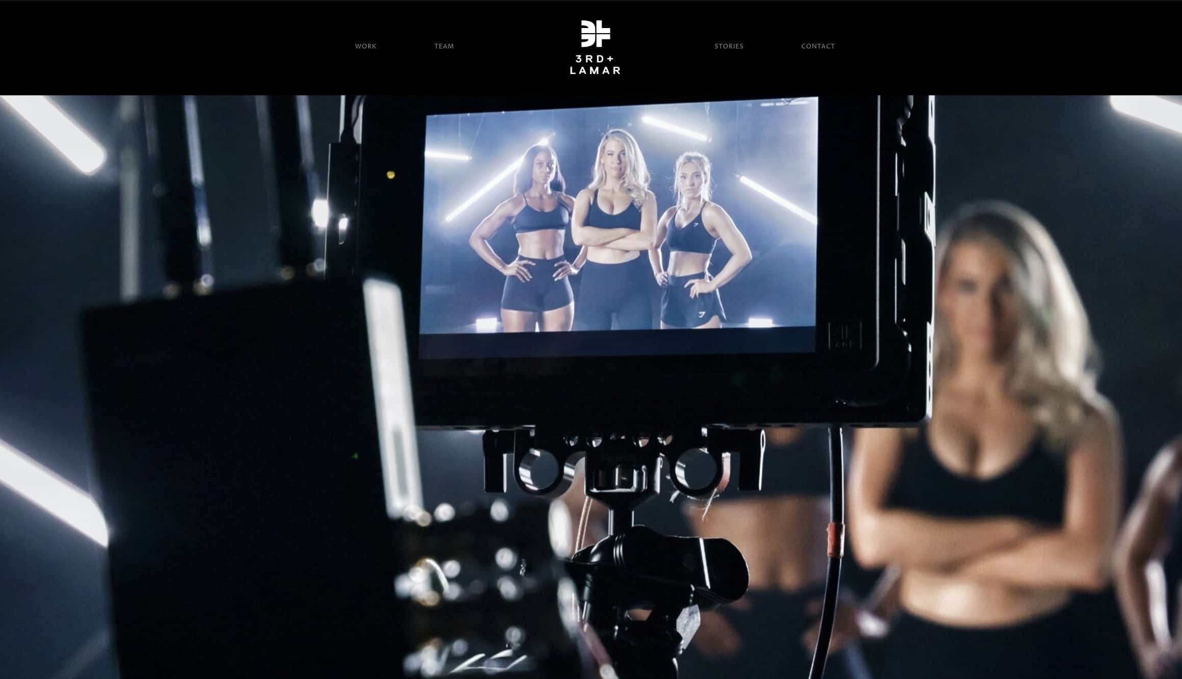
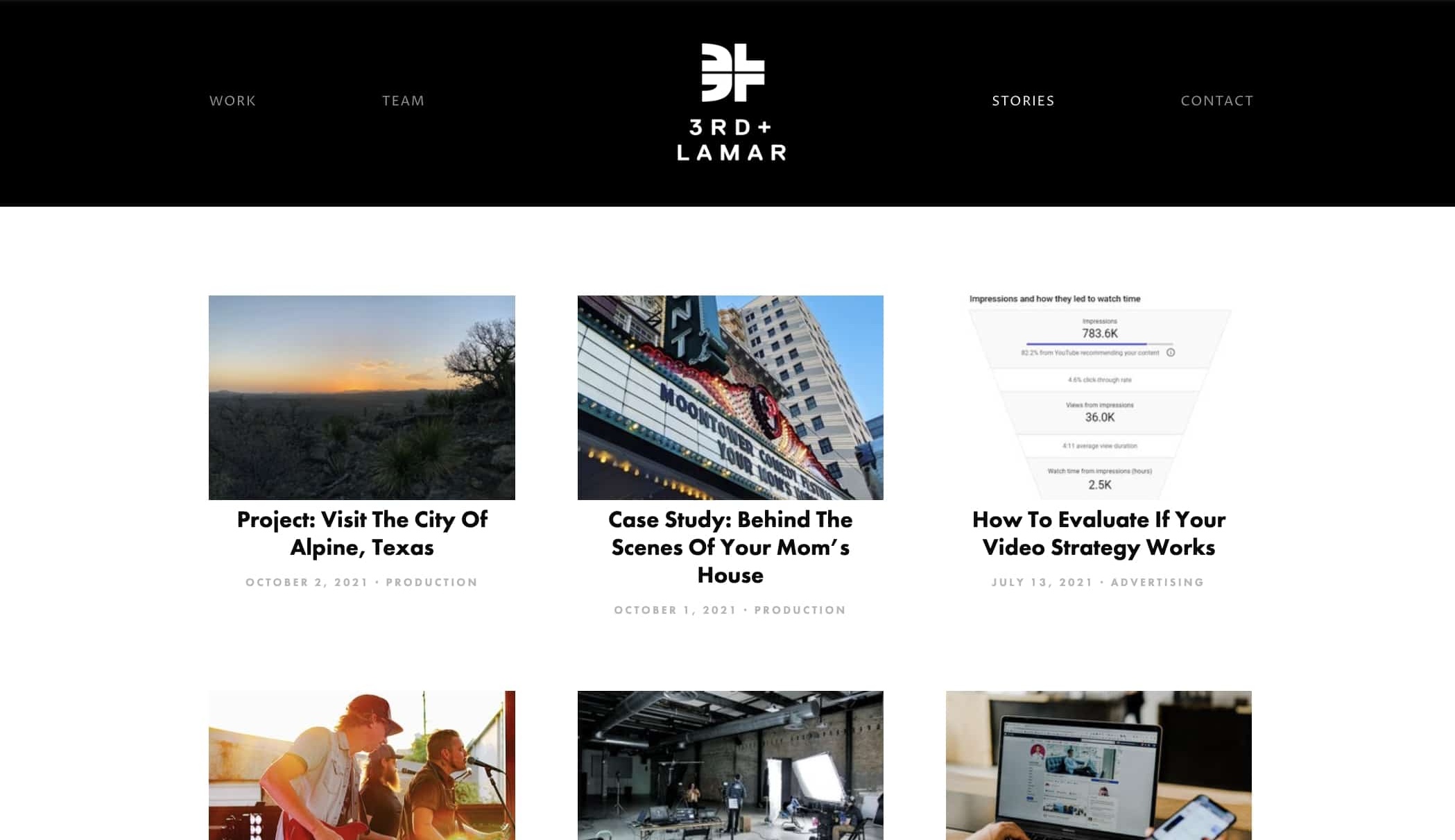
We wanted to put our work first, but which work? At our core, regardless of specialty, we are storytellers. And the story of us and our clients is our showreel.
Next, we wanted to clearly redefine ourselves. When people asked us what 3rd + Lamar did, we wanted to answer in one clear sentence:

We wanted users to understand the essence of 3rd + Lamar in five seconds or less. The incredible Michelle McGinnis built a custom website theme to accommodate our vision and imported our 3rd & Lamar Media content.
What we landed on—though we aim to be ever-evolving—is the site you see now. The website features a clean, modern design that showcases our portfolio of work with an emphasis on storytelling.
Everyone’s a designer
Once we green-lit our brand guidelines and website, we considered how to best leverage these assets.
Our brand + advertising coordinator, Frankie Pike, led an internal seminar where we updated all of our materials (i.e. decks, presentations, charts, etc.) to reflect the new brand.
3L-Brand-Design-Guide—4_20-PresentationTo announce the rebrand, we leaned on our new ethos and produced a series of short interviews that highlighted the breadth of work we do, the team’s unique strengths, and who we aim to be. We shared these videos on our website and social channels.
We also updated our social media handles, profile pictures, stories, and header images for consistency.
Finally unified
The rebranding efforts have paid off. In the quarters since the launch of the new brand, we have seen an increase in website traffic, social media engagement, and inbound interest generated from the website. The anecdotal feedback from our clients and other folks in our network also has been positive.
We’ve cleared up any confusion about the disparate segments of our business by presenting a cohesive brand story. But best of all, working together to think about who we are as a company unified our purpose and shared understanding of who we are as a team.


