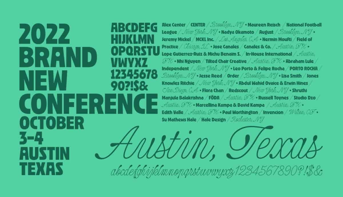
Brand New Conference, a two-day corporate and brand identity event, came to Austin this week, bringing 1,000 designers to the city.
The annual conference was planned for Austin in 2020 but got delayed due to the pandemic. It’s organized by graphic design firm UnderConsideration and is an extension of the firm’s blog, Brand New, which reviews corporate and brand identity design work.
Speakers included the designer of the Super Bowl LVI logo, Coca-Cola’s former design director, and designers who’ve worked for NIKE, Netflix, Whole Foods, BBC, Indeed, The Met, Amazon, Disney, ESPN, VEVO, José Cuervo, Planned Parenthood, USA Today, and YETI, to name a few.
We’ll be publishing an in-depth summary of the conference next week, but for now, here are some of our main takeaways:
- Brands are personal.
- Take risks.
- Begin with gratitude.
- Building for resilience is more important than building for growth.
- Don’t follow the trends.
- Brands aren’t about what you sell—they’re about what you do differently.
- In order to create a strong brand, you must be in touch with culture.
“To be a designer is to make decisions.”
-Porto Rocha
Coppertone updates their logo
On the topic of branding, Coppertone recently updated its 2019 logo, rounding the type, eliminating the sunshine, and bringing back the girl with the dog.

The sunscreen brand was founded in 1944 as a suntan lotion and has a long history. The type hasn’t changed much and is recognizable.
“The new wordmark keeps pretty much all the equity and structure of the OG 1970 mark but rounds off all the corners, which, while I’m not convinced is totally necessary, does give it a softer, mushier, more sunscreen-y feel that I suppose could justify the decision,” graphic designer Danica Mitchell said in the Brand New review. “More importantly with this rebrand, we see the re-introduction of ‘Little Miss Coppertone’ in her first ever single-color appearance, which is not only hugely more readable and better executed than any previous iteration, but also much more universally accessible thanks to the graphic approach of the illustration.”
If you look closely, though, you’ll notice that the dog is no longer pulling on the little girl’s swim bottoms, so the revealed tan line is lost. But perhaps “Little Miss Coppertone” and her dog are iconic enough that they don’t need that detail to represent the brand.
Other news
- Check out this chart showing price changes since 2000.
- Instagram rolled out longer stories.
- Slack is adding documents to its product.
- Twitter is going full-screen with video, which means 9×16 aspect ratio videos are important on Twitter, too.
- Jon Erlichman posted some of the first logos of tech companies. It reminds me of the saying from LinkedIn founder Reid Hoffman: “If you are not embarrassed by the first version of your product, you’ve launched too late.”
That’s all for this week‘s Marketing Roundup. Check back next week for more news. And subscribe to our newsletter below for additional updates.